


Roster Heatmaps
I’m a big Cornell basketball fan. A few years ago (ca. 2007-2010) this was a lot of fun. These days not so much; Cornell hasn’t finished in the top half of its conference since 2010. Part of this is certainly regression to the mean – Cornell going to the Sweet Sixteen (like they did in 2010) was probably a once in a lifetime kind of thing – but the consensus among the fans is that the departure of the old coach, and more to the point, the presence of the new coach, are a big factors in the continuing mediocrity of Cornell basketball.
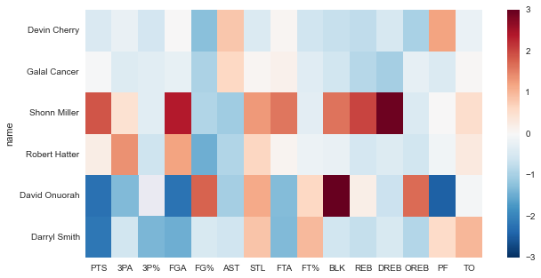
I want to see if there’s any way to validate (or invalidate) this feeling with some data, so I scraped the game scores and box scores of every college basketball game in the past couple years. There are lots of interesting things to do with this dataset, but first I want to visualize the current rosters of each Ivy League team somehow. Box scores are already in a grid, so a heatmap seems like a good choice. This is where we’re headed:
First, let’s get the standard imports out of the way:
%matplotlib inlineimport numpy as np
import pandas as pd
import seaborn as sns
import matplotlib.pyplot as pltNext we’ll pull in the raw box score and game score data, and take a look at what each looks like:
# import the raw data
boxes_raw = pd.read_csv('data/2015_box_scores2.csv', sep=',', \
                        encoding='latin-1', skipinitialspace=True)
print(boxes_raw.head(3))
3PA 3PM AST BLK DREB FGA FGM FTA FTM MIN ... REB \
0 0 0 0 1 1 0 0 2 1 13 ... 2
1 5 2 2 0 6 15 5 6 4 32 ... 8
2 3 0 1 0 1 3 0 0 0 21 ... 1
STL TO away game_ID name player_ID position starter \
0 0 0 True 400585875 Nick Shepherd 51255 F True
1 1 5 True 400585875 Chris Thomas 66741 F True
2 0 0 True 400585875 Nevin Johnson 56306 G True
team_name
0 Texas Southern
1 Texas Southern
2 Texas Southern
[3 rows x 23 columns]
games_raw = pd.read_csv('data/2015_game_scores.csv', sep=',', \
                        encoding='latin-1', skipinitialspace=True)
print(games_raw.head(3))
game_ID date away_name away_record away_half1 \
0 400585875 2014-11-14 Texas Southern (0-1; 0-1 away) 30
1 400595560 2014-11-14 Non D-I School NaN 22
2 400587365 2014-11-14 Non D-I School NaN 30
away_half2 away_OT away_final home_name home_record home_half1 \
0 32 0 62 E Washington (1-0; 1-0 home) 32
1 30 0 52 Sam Houston (1-0; 1-0 home) 55
2 22 0 52 E Michigan (1-0; 1-0 home) 32
home_half2 home_OT home_final
0 54 0 86
1 45 0 100
2 32 0 64
Since we’re going to be normalizing let’s choose an appropriate population, i.e. data from Ivy League conference games.
# select ivy league games / box scores (conference games only)
# note that the list is in order of conference standing
ivies = ['Harvard','Yale','Princeton','Dartmouth', \
         'Columbia','Cornell','Brown','Penn']
ivy_games = games_raw.loc[games_raw.home_name.isin(ivies) & \
                          games_raw.away_name.isin(ivies)]
ivy_boxes = boxes_raw.loc[boxes_raw.game_ID.isin(ivy_games.game_ID)]

# generate % statisitcs (FG%, 3P%, FT%)
ivy_boxes['3P%'] = ivy_boxes['3PM'] / ivy_boxes['3PA']
ivy_boxes['FG%'] = ivy_boxes['FGM'] / ivy_boxes['FGA']
ivy_boxes['FT%'] = ivy_boxes['FTM'] / ivy_boxes['FTA']
# replace inf with 0 (for cases with no attempted shots)
ivy_boxes = ivy_boxes.replace([np.inf, -np.inf],0)
Now that we have a subset of the data that only covers the Ivy conference games, time to aggregate and normalize each player’s statistics with some quick pandas-fu. First we normalize by average minutes played, then we compute the z score. At this point, each entry in a player’s statline represents the number of standard deviations his stat is above or below the mean of that stat for the population as a whole (for example, Shonn Miller’s DREB stat is 2.92, which means his defensive rebounding is 2.92 standard deviations above the mean). We’ll also take this opportunity to clean up the dataframe a little bit by selecting only the columns we want (i.e. the columns corresponding to box score stats).
# minimum average minutes played
MIN_CUTOFF = 10

# generate df with player season averages
players = ivy_boxes.groupby(['team_name','name']).mean()

# just want stats (not starting pct, home vs away %, game_ID)
stats = ['PTS', '3PA', '3P%', 'FGA', 'FG%', 'AST', 'STL', 'FTA', \
         'FT%', 'BLK', 'REB', 'DREB', 'OREB', 'MIN',  'PF', 'TO']
players = players[stats]

# we just want players who averaged at least MIN_CUTOFF min / game
# players with just a few minutes played will throw off the
# distribution and mess up the normalization
players = players.loc[players['MIN']>MIN_CUTOFF]

# normalize stats per 40 minutes played, then by zscore,
# then reset MIN column
zscore = lambda x: (x - x.mean()) / x.std()
players_norm = players.div(players['MIN'], axis=0)
players_norm = players_norm.apply(zscore)
players_norm['MIN'] = players['MIN']

# invert PF and TO columns, so that 'good' values match 'good' color
players_norm[['PF','TO']] = players_norm[['PF','TO']] * -1
Finally, let’s make some heatmaps to visually compare each team’s rotation (we’ll limit ourselves to the top 6 players per team by average minutes played; players farther down the bench typically haven’t played enough to accumulate statistically sound results):
# plot heatmaps for each team
fig, axes = plt.subplots(4,2, figsize=(16,16))
fig.tight_layout()

# flatten the array of array of axes
# think [leaf for tree in forrest for leaf in tree]
axes_flat = [ax for arr in axes for ax in arr]

# plot a heatmap showing, for each stat, how each player's season average compares to the league average
for ax, team in zip(axes_flat, ivies):
    sns.heatmap(players_norm.ix[team].sort('MIN', ascending=False).head(6).drop('MIN', axis=1), \
                ax=ax, vmin=-3, vmax=3)
    ax.set_title(team)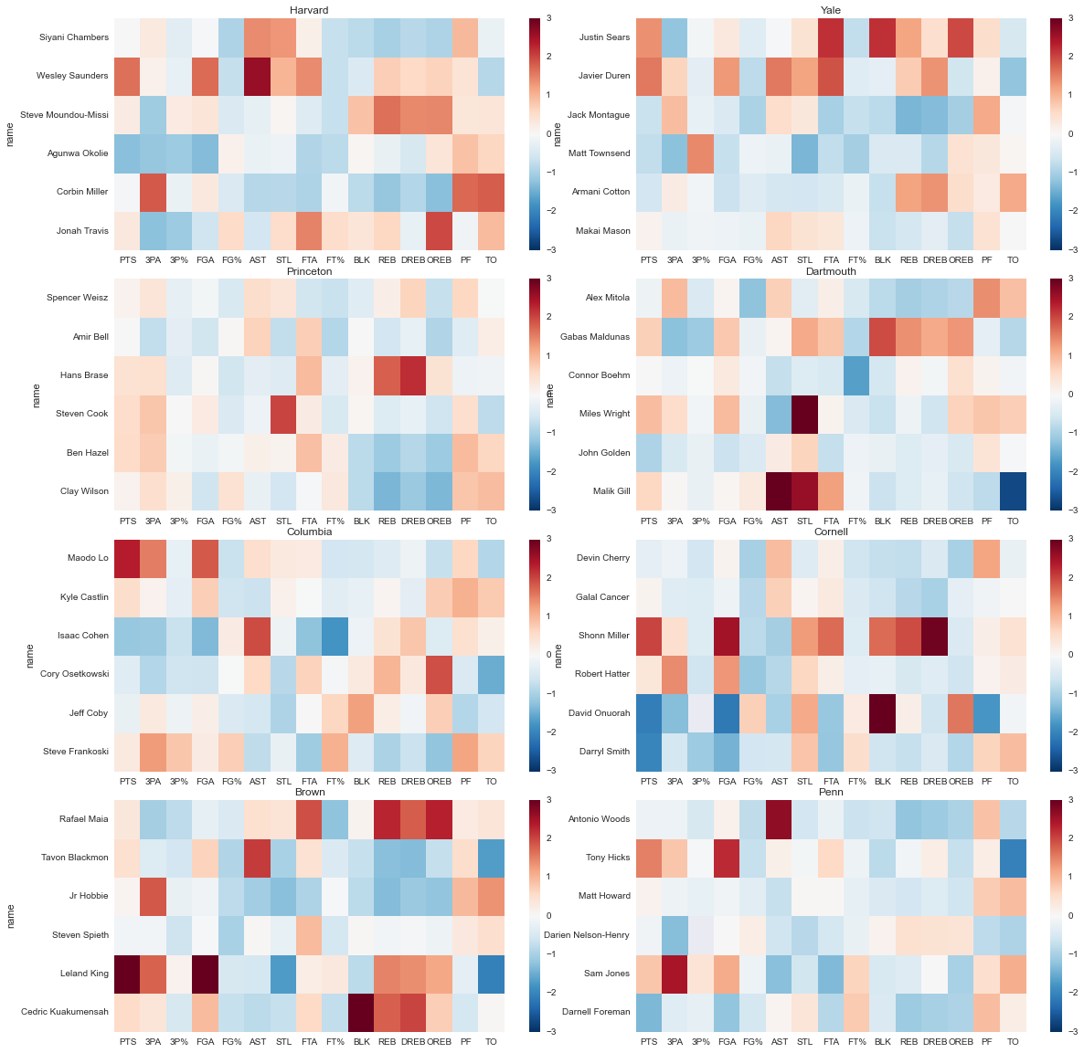
That’s an awfully lot of visual information all at once, so let’s see if we can break it down and pull out something meaningful.
First off, there isn’t a clear gradient from best to worst: Penn (last in the league) might be a bit more blue (below the mean) overall than Harvard (first in the league), but it’s hard to say for sure. So we can’t immediately infer team quality from player quality. (Side note: I’m taking season average statistics to be a proxy for player quality. There are confounding factors, for example players on a team with a well-run offense will have inflated offensive statistics relative to their individual skill levels, but on the whole I think it’s good enough for a first pass). This does point towards the effect of coaching, as per our original hypothesis. Still, we’ll be able to say more concrete things along those lines later, with a more rigorous analysis.
A few other observations:
-
Cornell and Dartmouth both have above average steals (STL) accross the board. I know Cornell typically plays a pressure defense, and a little googling shows that Dartmouth does too. It’s nice to see that show up in the data.
-
Princeton is very well balanced.
-
Shonn Miller (one of Cornell’s starting forwards) is a monster. Presumably that’s why he’s finishing his college career at UConn.
One final observation: it looks like just about everyone is a sub-par shooter, percentage-wise. This seems suspicious, so let’s look at the distribution for each of the percentage stats:
# plot the distributions of each 'percent' stat (FG%, FT%, 3P%)
fig, axes = plt.subplots(1,3, figsize=(16,4))

for ax, stat in zip(axes, ['FT%','FG%','3P%']):
    sns.distplot(players_norm[stat].dropna().order(), ax=ax)
    ax.set_title(stat)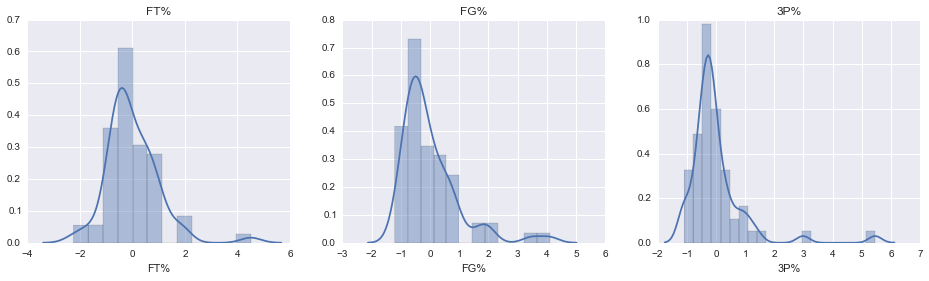
Looks like a few outliers are skewing our percentage distributions, and shifting the mode below zero. Let’s have a look at who those outliers are:
# select the top 10 players by 3P%
print(players_norm[['MIN','3P%','3PA']].dropna().sort('3P%', ascending=False).head(10))
MIN 3P% 3PA
team_name name
Brown Jason Massey 10.500000 5.456531 -1.172227
Princeton Pete Miller 16.857143 2.987737 -1.208654
Yale Matt Townsend 27.266667 1.431015 -1.234103
Dartmouth Tommy Carpenter 14.928571 1.212292 -1.132942
Penn Camryn Crocker 11.571429 1.031606 -0.392326
Columbia Kendall Jackson 10.615385 1.014541 0.480357
Steve Frankoski 18.083333 0.830811 1.283110
Princeton Henry Caruso 18.785714 0.739592 -0.512969
Yale Greg Kelley 12.866667 0.690840 1.085452
Columbia Luke Petrasek 16.250000 0.411725 0.842856
For three-point shooters, the outliers are dominated by players with a negative 3PA stat, i.e. players who took less than the average number of threes and just happened to make a lot of them. (Remember, we took the z score for each stat, so each entry is actually the number of standard deviations above or below the mean). Also, according to this Columbia has three of the four best actual three point shooters in the league. Sigh … I miss Ryan Wittman.
You can find the ipython notebook for this page here, the box score data here and the game score data here.