


In-game coaching
As I mentioned before, I’m a big Cornell basketball fan. One particular point of contention among Cornell basketball fans is whether the current coach Bill Courtney makes strategically sound decisions during games. The consensus among fans (or rather, the subset of fans that takes to the internet to complain) is that he’s a bad in-game coach, at least compared to the previous coach Steve Donahue. This certainly isn’t unique to Cornell – lots of fanbases are unhappy with their coach’s in-game coaching abilities (see Crean, Tom) – but Cornell presents a nice case for analysis because we have a (comparatively) decent amount of data from both B.C and A.D eras (Before Courtney, and After Donahue, natch).
There are a lot of factors that go into a team’s success or failure besides in-game coaching, but in this post I’m only asking “Is Bill Courtney a worse in-game coach than Steve Donahue?” Inspired by an example in Bayesian Methods for Hackers I’m going to try to address this question using historical box score data and some Bayesian tools.
The plan of attack:
- Generate a regression that predicts the number of wins a team should have, based on its season-averaged box score statistics.
- Compare Cornell’s actual number of wins to the predicted value, for each season for which we have data.
- Do some Bayesian analysis to estimate whether there was a change in performance relative to box-score based expectations that coincided with the coaching change.
The premise is that, given a fixed set of stats, differences in game outcomes are determined by in-game coaching decisions (i.e. when to call a time-out, what kind of play to draw up in important situations, etc). This certainly isn’t completely true, but hopefully it will be good enough to say something interesting.
I’ll note at the outset that this isn’t a particularly rigorous analysis. First, we’re limited by the fact that our data only go back to the 2001-2002 season. Any conclusions we can draw from such a small sample size are necessarily going to be imprecise. Second, the ‘data’ that we’re using for our Bayesian analysis is a function of a predicted number of wins. This exposes us to errors from bad predictions. Finally, it’s possible that the effect of a particular coach’s in-game coaching abilities is actually uncorrelated with the difference between actual and predicted wins. Caveats aside, let’s see what we can do.
There’s a fair amount of data wrangling that goes into converting the raw box score data into a form we can use. I’ll omit that here, but it’s included in the ipython notebook for this post. Once it’s all wrangled, our data looks like this:
# the list of stats used in our predictions
fit_stats = ['3PA', 'AST', 'BLK', 'FGA', 'FTA', 'OREB', 'PTS','REB', 'STL', 'TO','PAPG']

print(fitting_data[fit_stats + ['total_wins']].head())
3PA AST BLK FGA FTA \
season team_name
2009 AR-Little Rock 14.354839 13.032258 3.483871 51.258065 23.000000
AR-Pine Bluff 13.903226 10.935484 2.709677 57.032258 20.935484
Air Force 17.612903 12.193548 2.258065 44.806452 18.806452
Akron 21.514286 12.314286 2.257143 54.628571 19.628571
Alabama 15.000000 11.156250 4.500000 59.843750 22.218750
OREB PTS REB STL TO \
season team_name
2009 AR-Little Rock 9.645161 66.419355 31.516129 5.516129 14.741935
AR-Pine Bluff 11.838710 62.677419 33.580645 8.741935 19.096774
Air Force 6.193548 58.741935 25.838710 5.000000 12.709677
Akron 9.600000 66.828571 29.342857 7.714286 13.657143
Alabama 11.531250 73.406250 35.593750 7.187500 13.906250
PAPG total_wins
season team_name
2009 AR-Little Rock 63.354839 23
AR-Pine Bluff 70.645161 13
Air Force 62.451613 10
Akron 59.828571 23
Alabama 70.437500 18
Each stat in fit_stats will be a predictor in our model, while total_wins is
the dependent variable.
Before we fit our predictive model we need to split the data into training and testing sets.
# split our data into subsets for testing and training
X_train, X_test, y_train, y_test = \
cross_validation.train_test_split(fitting_data[fit_stats], \
                                  fitting_data['total_wins'],\
                                  test_size=0.4, random_state=0)
Time to generate a predictive model. We’re trying to map a vector of continuous variables (the box score statistics) to a single scalar (total number of wins during the season), which is a textbook use case for linear regression. As a sanity check, we’ll see which predictors have the strongest effect on the outcome according to our model.
# train a linear regression model
linreg = linear_model.LinearRegression(normalize=True)
linreg.fit(X_train, y_train)

# check which stats have a large effect on the prediction
coef_df = pd.DataFrame(list(zip(full_stats, linreg.coef_))).sort(1)
coef_df['abs'] = coef_df[1].apply(np.abs)
coef_df = coef_df.set_index(0).sort('abs', ascending=False).transpose()
print(coef_df.head(1))
0 PTS PAPG FTA TO REB OREB FGA \
1 0.850119 -0.847656 0.107432 -0.074724 0.074576 -0.070238 -0.044737
0 BLK 3PA STL AST
1 0.042777 0.016987 0.013339 0.013327
The two biggest predictors are points-per-game and points-allowed-per-game; or, in the immortal words of John Madden, “Usually the team that scores the most points wins the game.” So far so good, now let’s see how our linear regression model does when fitting the test data.
# define a helper function to plot fits and residuals
def plot_regressor(regressor, y_test, X_test, title):

    y_pred = regressor.predict(X_test)

    fig, (ax1, ax2) = plt.subplots(1,2, figsize=(16,5))
    fig.suptitle(title, fontsize=20)

    ax1.scatter(y_test, y_pred, alpha=0.15)
    ax1.set_xlabel('actual wins')
    ax1.set_ylabel('predicted wins')
    ax1.plot([0,35],[0,35])

    sns.regplot(y_pred,y_test-y_pred, scatter_kws={'alpha':0.3}, ax=ax2, fit_reg=True)
    ax2.set_xlabel('predicted wins')
    ax2.set_ylabel('prediction error')

    print('Pearson R : {:.4f}'.format(pearsonr(y_test, y_pred)[0]))
    print('R^2       : {:.4f}'.format(regressor.score(X_test, y_test)))
print('RMSE : {:.4f}'.format(np.sqrt(metrics.mean_squared_error(y_test, y_pred))))plot_regressor(linreg, y_test, X_test, 'Linear Regression')Pearson R : 0.9299
R^2 : 0.8639
RMSE : 2.2881
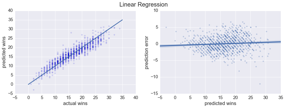
Looks like a linear regression model does a pretty good job predicting total number of wins. Just for kicks, let’s try a Random Forest regression as well.
forest = ensemble.RandomForestRegressor(random_state=0)
forest.fit(X_train, y_train)

plot_regressor(forest, y_test, X_test, 'Random Forest Regression')
Pearson R : 0.9152
R^2 : 0.8374
RMSE : 2.5010
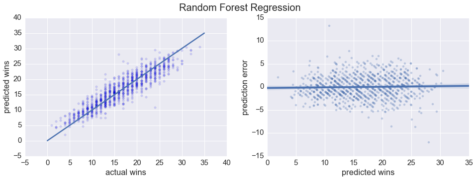
All in all, pretty similar. We can look at the distribution of the prediction errors for both regressions to get a more direct visual sense of how they compare.
fig, (ax1, ax2) = plt.subplots(1,2, figsize=(16,6))

compare = pd.DataFrame(y_test)
compare['forest'] = forest.predict(X_test)
compare['linear'] = linreg.predict(X_test)
compare['avg'] = (compare['forest'] + compare['linear']) / 2
compare['pred_diff'] = compare['forest'] - compare['linear']

compare['forest_diff'] = compare['total_wins'] - compare['forest']
compare['linear_diff'] = compare['total_wins'] - compare['linear']

bins = np.arange(-7,7.25, 0.5)
sns.distplot(compare['forest_diff'], kde_kws={'label':'forest'}, bins=bins, ax=ax1)
sns.distplot(compare['linear_diff'], kde_kws={'label':'linear'}, bins=bins, ax=ax1)
ax1.set_xlim([-7.5,7.5]);
ax1.set_xlabel('prediction error')
plt.suptitle('Linear Regression vs Random Forest', fontsize=20, y=1.051);

sns.regplot(compare['forest_diff'], compare['linear_diff'], scatter_kws={'alpha':0.3}, fit_reg=False, ax=ax2)
ax2.set_xlabel('Random Forest prediction error')
ax2.set_ylabel('Linear regression prediction error')

plt.tight_layout()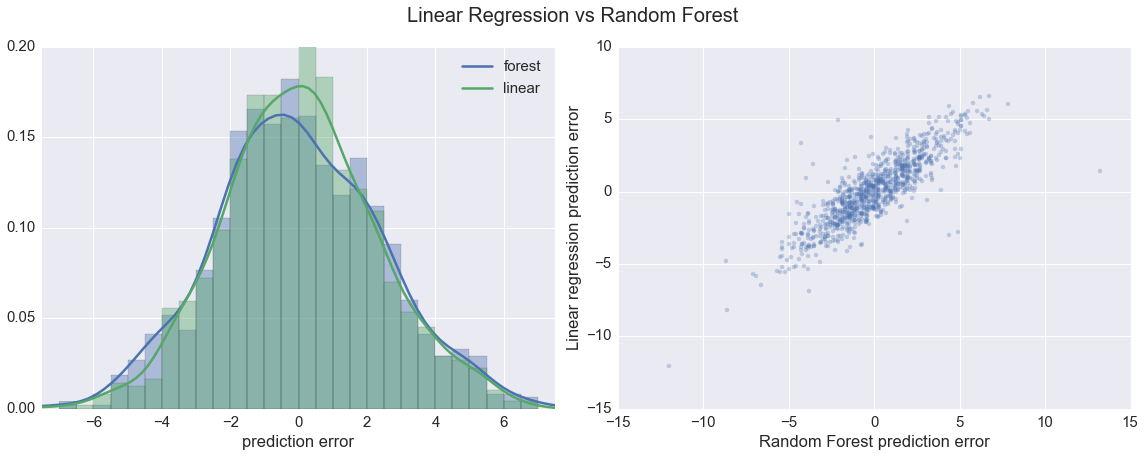
print(compare.describe().ix[['mean','std']][['forest_diff','linear_diff']]) forest_diff linear_diff
mean -0.015638 0.029887
std 2.502284 2.289120
The distributions of the prediction errors for the two models are very similar. More importantly, the errors of the two predictors are pretty strongly correlated. This latter point makes me somewhat confident that differences between predicted and actual wins are related to the performance of the team, and not just noisiness in the regression.
At this point we have a model that can predict a team’s season wins based on that team’s average statistics. Time for a change in perspective: instead of considering differences between predicted and actual wins to be prediction errors, let’s consider them observations of over- or under-performance. If a team is predicted to win 20 games, but only wins 16, then instead of saying the model was wrong by 4 games we say that the team under-performed by 4 wins, and we attribute this under-performance (at least partially) to in-game coaching. This is definitely not rigorous, but hopefully the analysis will still be interesting.
We’re ready for step two: compare Cornell’s actual wins to predicted wins. The data we used to train the model only goes back to the 2008-2009 season, so I manually scraped Cornell’s statistics through the 2001-2002 season. I’ll omit that code as well and just show the results:
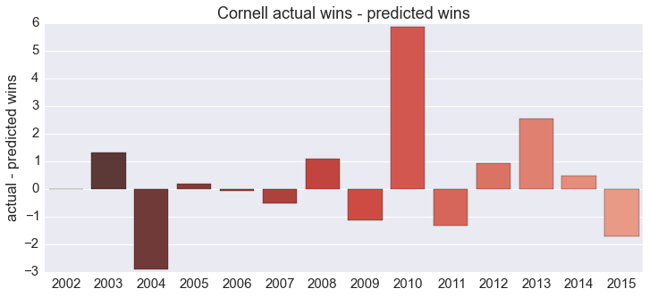
A quick reminder: with this analysis we’re only addressing in-game coaching. 2014 was a miserable season for Cornell (they went 2-26), and coaching was surely a factor. According to this, however, in-game coaching wasn’t to blame: Cornell won about 1/2 game more than they were predicted to based on their season-average statistics, which is well within a standard deviation of the mean.
Cornell changed coaches between the 2010 and 2011 seasons; looking at the plot it’s hard to say if the performance is markedly different during the two eras. This is where Bayesian tools come in, specifically a Markov Chain Monte Carlo (MCMC) method. The python package PyMC implements the heavy machinery for us, and I’ll defer to Bayesian Methods for Hackers for a detailed explanation of how it works; the model we’re using here is lifted almost verbatim from the first chapter.
import pymc as pm

# our 'data' points are the difference between predicted
# and actual wins for each season
data = y_diff
n_data = len(data)

# use the mean, stddev of the linear regression
# errors as our priors
mu_1 = pm.Normal('mu_1', 0.03, 2.3)
mu_2 = pm.Normal('mu_2', 0.03, 2.3)

tau = pm.DiscreteUniform("tau", lower=2002, upper=2015)

# model the over- or under-performance as being normally
# distributed, both before and after the coaching change.
@pm.deterministic
def mu_(mu_1=mu_1, mu_2=mu_2, tau=tau):
    out = np.zeros(n_data)
    out[:tau] = mu_1
    out[tau:] = mu_2
    return out

observation = pm.Normal("obs", mu_, value=data, observed=True)

model = pm.Model([observation, mu_1, mu_2, tau])

mcmc = pm.MCMC(model)
mcmc.sample(40000, 10000, 1)

mu_1_samples = mcmc.trace('mu_1')[:]
mu_2_samples = mcmc.trace('mu_2')[:]
tau_samples = mcmc.trace('tau')[:]
[-----------------100%-----------------] 40000 of 40000 complete in 7.9 sec
We’re making two assumptions in the code above:
- For both coaches, the over- or under-performance of the team from season to season is normally distributed. The mean of this distrubtion is (at least partially) a function of the coach’s in-game coaching skill.
- At some point between the 2002 and 2015 seasons, there was a transition and the mean of the distribution changed.
These assumptions contain three parameters: the mean of the over/under performance distribution for each coach (\(\mu_\texttt{SD}\), \(\mu_\texttt{BC}\)), and the season during which the transition occurred (\(\tau\)). The PyMC code takes the assumptions above, and returns probability distributions for each of the three parameters based on the data we provide.
If, as per our original hypothesis, the new coach (Bill Courtney)’s in-game coaching is significantly worse than the previous coach (Steve Donahue)’s, then the peaks of the two distriubtions returned by PyMC should be nicely separated, with Donahue’s to the right of Courtney’s. Additionally, the distribution for \(\tau\), the season during which the transition occurred, should be sharply peaked around 2010.
from IPython.core.pylabtools import figsize
figsize(12.5, 10)

ax = plt.subplot(311)
ax.set_autoscaley_on(True)

plt.hist(mu_1_samples, histtype='stepfilled', bins=30, alpha=0.85,
         label="posterior of $\mu_1$", color="#A60628", normed=True)
plt.legend(loc="upper left")
plt.title(r"""Posterior distributions of the variables
    $\mu_\mathtt{. SD},\;\mu_\mathtt{. BC},\;\tau$""")
plt.xlim([-3, 3])
plt.xlabel("$\mu_\mathtt{. SD}$ value")

ax = plt.subplot(312)
ax.set_autoscaley_on(False)
plt.hist(mu_2_samples, histtype='stepfilled', bins=30, alpha=0.85,
         label="posterior of $\mu_2$", color="#7A68A6", normed=True)
plt.legend(loc="upper left")
plt.xlim([-3, 3])
plt.xlabel("$\mu_\mathtt{. BC}$ value")

plt.subplot(313)
w = 1.0 / tau_samples.shape[0] * np.ones_like(tau_samples)
plt.hist(tau_samples, bins=n_data, alpha=1,
         label=r"posterior of $\tau$",
         color="#467821", weights=w, rwidth=2.)

plt.legend(loc="upper left")
plt.ylim([0, .2])
plt.xlim([2002, 2015])
plt.xlabel(r"$\tau$")
plt.ylabel("probability");

plt.tight_layout()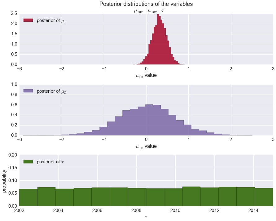
Well, looks like the data do not agree with our hypothesis. The most damning result is the flat distribution of \(\tau\): according to our MCMC at no point in the past 13 years was there a drastic change in the quality of in-game coaching. Of course there are a number of other possible explanations, first among them that our mapping from prediction error to over/under performance was invalid. It could also be that we just don’t have enough data yet. Good thing Cornell just gave Courtney a contract extension …
Long story short, you can add this to the list of blog posts that conclude that it’s hard to measure the effect of a coaching change. Sometimes the data just doesn’t tell the story you want it to tell.
The ipython notebook for this post is here and the data is here and here.